
Tagged: precision

What’s the point of graphs? Help for IGCSE Biology
A student contacted me to ask “what’s the point of graphs?” I hope this short post may help.
A graph is just a way to visually represent the data you have collected in an experiment so it is easier to see any patterns. Some people can see trends and patterns just in a column of numbers, but I need a graph to show me exactly what is going on.
There are a few essential things when plotting a graph in an exam question. The examiners use the acronym SLAAP for allocating marks so students should be fully aware what these mark points stand for….
S stands for Scale: choose a linear scale on the two axes that means your graph uses up as much of the space given on the page – this mark will not be given if a tiny graph is plotted in the bottom left corner of the page.
L stands for Line: when plotting experimental data in Biology, it can never be wrong to join each point to the next with a straight line. This “dot to dot” plotting does not allow you to read off the graph to find intermediate values, but does best show the trend in results. But read the question carefully – the examiner may want you to plot a “line of best fit” or a freehand curve through the points. If they don’t explicitly mention it, get a ruler and join dot to dot with straight lines.
A stands for Axes: have you plotted the axes the correct way round? This often foxes students as they don’t see why it is so important. But there is a correct way of plotting a graph. The thing that you have measured in your experiment (the dependent variable) always goes on the y axis. The thing that you have altered in your experiment (the independent variable) always goes on the x axis.
A stands for Axes (again): this mark is for labelling your axes correctly. Everyone puts the numbers on the axes but often students leave out units and so lose the mark. Remember to always add the units to every axis you plot!
P stands for Points: this mark is for correctly plotting the points on the axes you have drawn – now what could be simpler than that!
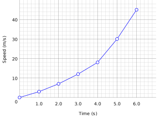
A well plotted graph that would score 5/5 on an iGCSE question. They have measure the speed of a car starting from rest for 6 seconds – perhaps it’s not a car but a rocket…. 40m/s after 6s sounds like impressive acceleration to me!
Finally a comment about the difference between precision and accuracy when analysing experimental data. In an ideal world you want your data to be precise and accurate but understanding the difference between the two can be really important….
I think that Precision is to do with how data is measured. Precise data is clustered closely together. If you measured the time it takes for a reliable experiment to happen with a sundial, the data would be very imprecise. The same experiment, measured with a stopwatch would generate precise data. If asked how to improve the precision of an experiment, the first thing to look at is how is the dependent variable being measured?
Accuracy is how close your measured value is to the “true” value. If you are trying to kick a football into a goal and you always hit the left hand post, you are not accurate but you are precise! Accuracy can often be improved in an experiment by controlling other variables better.

